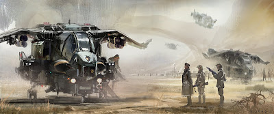
I personally like version 2 on the top, I spent more time to create a scene and tell a story. But some of my friends (mostly non-artist) tells me that they like my earlier version 1 better. They say there is more emotion. I was going to submitt this to art forums but not sure which one is better. HELP ME CHOOSE:)!~
 version 02
Thanks guys.

18 comments:
Definitely version 2. I don't think you need the third character that's standing to the far right, it creates an unpleasant tangent with the spacecraft behind him, just a personal thought. Great work on both though!
I prefer version 2 overall but I like aspects compositionally of version 1, especially how the vehicle on the left's silouette contrasts and pops out from the background,both are sweet though!
cheers,
Isaac
I think Version 2 works better with the theme/ concept of 'Marines of the Near Future' - I do agree that version 1 is more emotional because of the lone ship & lone figure but apart from that I feel it lacks content - I guess I get what you mean when you say you were adding a story to the image. Version 2 has more points of interest and I like the way you manage to suggest things like the 3rd ship landing in the distance- it isn't detailed but the colours and technique you use really pull this off in my opinion.Version 2 I think has 'more to say' visually than version 1.
version 2!
V1 doesn't match the title. Now if it was "lone space exploration" or "lost" or something, yeah it would work. Don't take me wrong they are both gorgeous piece of art.
V2, with more to say and more to see suggest an army in the background that match the title better.
no choice man! V2 it is!
Without a doubt version 2. Version is good for maybe a size and concept overall, but ver. 2 tells a story in and of itself as well as giving both the concept and delivering a solid and constructed idea.
I LIKE VERSION 1!
I agree with your friend's opinion,there is more emotion.
I do get more thoughts from that!
Also the machine is lighter than version 2 and i like that!
Version 2!
I like version 1 the best. I like the simplicity of the composition and I think it tells a stronger and more emotional story then the busier version 2. I feel like version 1 shows a more emotional connection between the pilot and his air craft. I really like the feeling it gives me.
Version 2
I like version 2 best just because it gives a little more "back story" to the sketch by having more stuff going on in the background.
The version with the three characters..this version has much more atmosphere..and depth.
i like the shakiness of the scene..good work !: )
Thanks everyone for the comments! Alstonink- thanks for pointing out the tangent, I noticed I had a highlight going right thru the head. Although I prefer to have three as a group, so I shifted the jet a bit. Version 1 definately captures more emotion and better composition. So Im going to uses it as a wallpaper:)
As a concept painting version 2 works better and most of you seem to prefer it too.
Thank you all for the great great comments~!
I prefer version 2, it has more going on and has more visual interest.
version 02
Version 2. The hovering image just above grade with the bounced lighting coming through, it's all very striking and leaves a stronger impression.
Version 02
Version 02
If you want to know more about Xero software and its Payroll services, contact Xero Customer Service Phone Number with its 24x7 hours' service.
Post a Comment